

.
.
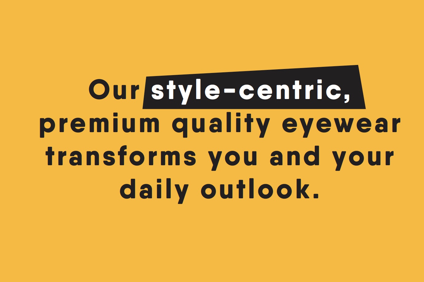
Eyebobs® is a local Minnesota brand that focuses on stylish and affordable reader frames. This brand came to use with a strong point-of-view and personality, it was up to us to refresh their brand with that in mind, yet improve the shopping/buying process.
Creating a brand identity system that has the right balance in communicating important selling/product information with quirky, cheekiness. Targeting an age group of consumers that are just starting to experience difficulties with reading smaller type and making that experience not so daunting, better yet making it a pleasant, exciting experience. Where they could feel some freedom in exploring their style with out the financial guilt.
Designing a easy to understand shopping experience that brings the products features and design to the forefront, and incorporating some sassy light hearted messaging, makes the shopping experience more delightful and exciting — less of a dreadful realization and chore!
KATE CARLSON
+ brand identity
+ SU2C campaign designer
+ illustrator/iconography
+ product photographer/stylist
+ copy writing
+ brand manifesto
+ packaging
NICK ZDON
+ design director
+ copy writing
STEFAN HARTUNG
+ creative director
+ copy writing
MARY KEMP
+ brand strategy
.
.
STAND UP 2 CANCER CAMPAIGN


Branding
Branding

Before

After